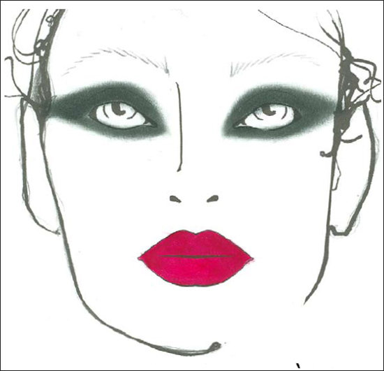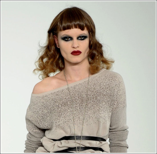
Charlotte Tilbury describes the look at L.A.M.B. as, “The feeling was 1930s prostitute–trampy, smoky eye, deep “rougeoir” lips and beautiful pale skin.”
You know, it’s not often that ‘prostitute’ is openly admitted to being an inspiration. Gee, the clothes are nice, but you know what would tie everything together? Just a smidge of whore. Not 1990s Julia Roberts Hooker With A Heart Of Gold whore, but a more classy sort of starving rabid raccoon whore. Perhaps we could have them walk to ‘Money (That’s What I Want)’, too? Or is that too whorish? One thing’s for sure–we need overdrawn red lips or we risk our models with deeper eye sockets looking like Skeletor.
So let’s see it in action–
WHOA. WHOA.
I know the look you are going for, and it is NOT 1930s prostitute. It is 1975 transvestite.
I just…wow. Wow. I suppose if they wanted the clothes to look beautiful by comparison to the jacked-up things they’ve done to the models–horrifyingly unflattering makeup, frizzy hair…THOSE BANGS, then jolly good show, L.A.M.B.. The problem is we can’t not look at a trainwreck. I look at that picture and I don’t even see the clothes.


Yeah.
A better soundtrack might be 53rd & 3rd, which is all about rent boys.
You always make the best song suggestions. 🙂
Thank you!
If we were doing a playlist, I’d also put Sister Ray in there.
If I ever have a whore fashion show, I’m calling on you to put together the playlist. 😀
You’re SO on.
Some thoughts, mainly on theme, to be edited down for groove…
Let’s see:
Bowie, “Candidate”…
Sonic Youth, “Kissability”…
PJ Harvey, “50ft Queenie”….
Peaches, “Shake yer Dix”…
Lifter Puller, “Manpark”
Good lord, it’s like a clown exploded on her face.
I think she’s been shot with Homer Simpson’s makeup gun.
I am disappointed in myself for not making this comment first.
That’s ok. We’re none of us perfect.
Now, don’t judge her. A girl can’t be too picky in that business. One week it’s a Shriner’s convention, next week it’s Ringling Brothers & Barnum & Bailey.
Do you think they’d be able to fit two people in those tiny cars? Poor woman would have to be pretty damn limber.
Either that, or she’d have to stick to the hotel.
I let out a little shriek sitting here at my desk. Those bangs make me want to attack the monitor with a bottle of White-Out.
Seriously, how did they not notice the bangs? I have been known to (in the past) trim my own bangs POORLY and *I* noticed those.
It’s not because of the whore look, that’s just a cover. It’s because of fucking American Apparel and their bullshit.
I look at American Apparel ads and want to feed the girls sandwiches.
I look at them and think about what the 1970s looked like at Club 54. And not the attractive way. The cokedrizzle from the nose, the smeared makeup, the strungout behavior, the Madeline Kahn/Bernadette Peters hair.
Ew. Ew Ew Ew.
I know, it’s like they picked EVERY SINGLE unflattering thing they could do to this model. I bet under different conditions she is striking and beautiful but in this instance…wow. Total fail.
If she sucked her cheeks in a bit more she’d be making a fishface.
I dunno, she might actually be that thin. Look at how much her collarbone protrudes and how bony her shoulder is!
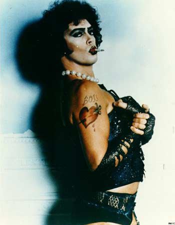
Sadly, the look works better on Tim Curry than on the model
I think Tim Curry can work a LOT of things better than anyone else on the planet. Including green hair and a cape with a 30ft wingspan.
And horns. Don’t forget the big, massive……horns.
He also manages to be a more terrifying clown than any other clown in the history of time, including ouchy the clown and john wayne gacy.
Curry is stupidly amazing at becoming the person he’s portraying. It’s flat out ridiculous.
omg I wanted to have sex with the devil when he did that….
I ask you, who hasn’t wanted to bone down with Tim Curry at one point or another?
Mm MMm mmmm yea… pretty much all the time 😛
That is just…horrifying. Are we sure that girl IS a girl? No offense to her, but I sincerely thought “eew, what a ugly dude” before I even scrolled down to the Frank N. Furter pic.
From another blog response, I reiterate my assertion that you don’t need to be a *quote* “professionally trained” artistic makeup person. You can clearly do a metric shit ton better than whoever came up with this fashion WTF idea!
I’m pretty sure it’s a girl. It’s the wider jaw and gaunt cheeks that give off the masculine vibe, and the really unflattering makeup and hair doesn’t help at ALL. I understand about unflattering hair causing one to look masculine as I have been called ‘young man’ a time or two myself.
THis is actually pretty fun. You see, I was just playing with makeup(sometimes I like to draw on my face, ok?!) and I’m currently wearing smokey eyes and overdrawn dark red lips. Now I don’t think I look like a RHPS extra but… I’m not planing on leaving the house either.
Oh, I don’t have any problem with the idea, it was the execution that had me horrified. One of the other models for the show pulled the look off much better:
It fits better with her features, with the softer brows, differently-set eyes, and the overall better blending job by the artist. Her bangs are still wonky, though.
That IS better. The first one has such weird hair. Having bangs half way up your forehead always looks tacky. Like a cheap wig.
In a less self centered comment:
It’s done SO poorly on her! Somehow this is what I imagine really happens when popular girls “make over” the shy nerdy girl. They do this, and then they laugh.
More than the makeup, even, it’s the awful AWFUL hair that drives me crazy. I bet if she were bald she would look GREAT.
I dunno, bald with drag make up might be a mistake… an improvement, but still a mistake.
In general, I am a fan of bald on women when they’ve got great bone structure. IMHO it looks powerful and yet enhances their femininity, too.